Free · browser only · nothing uploaded
Apply the matcha filter.
The same colour model the removal tool inverts, run forwards. Drop a photo or clip in and save the result. The PNG carries your original inside it, so this page is the one place the look can be taken back off cleanly.
What it looks like
Drag any image to compare
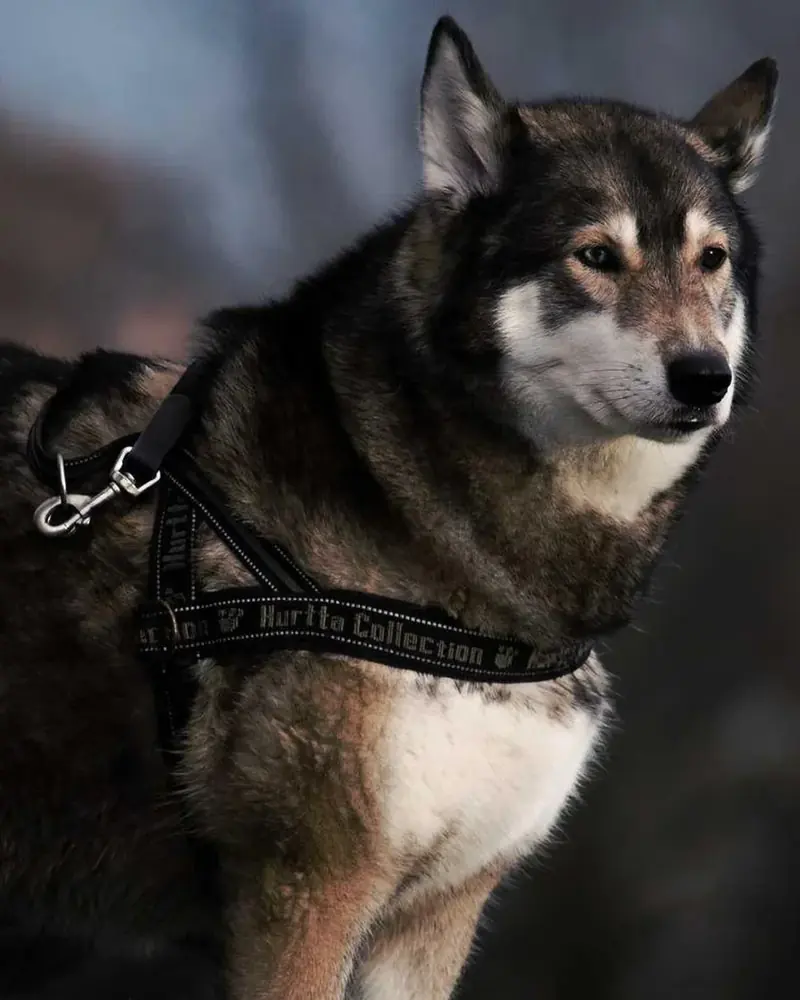
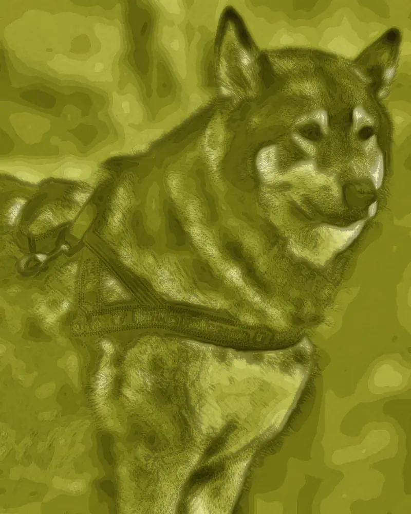
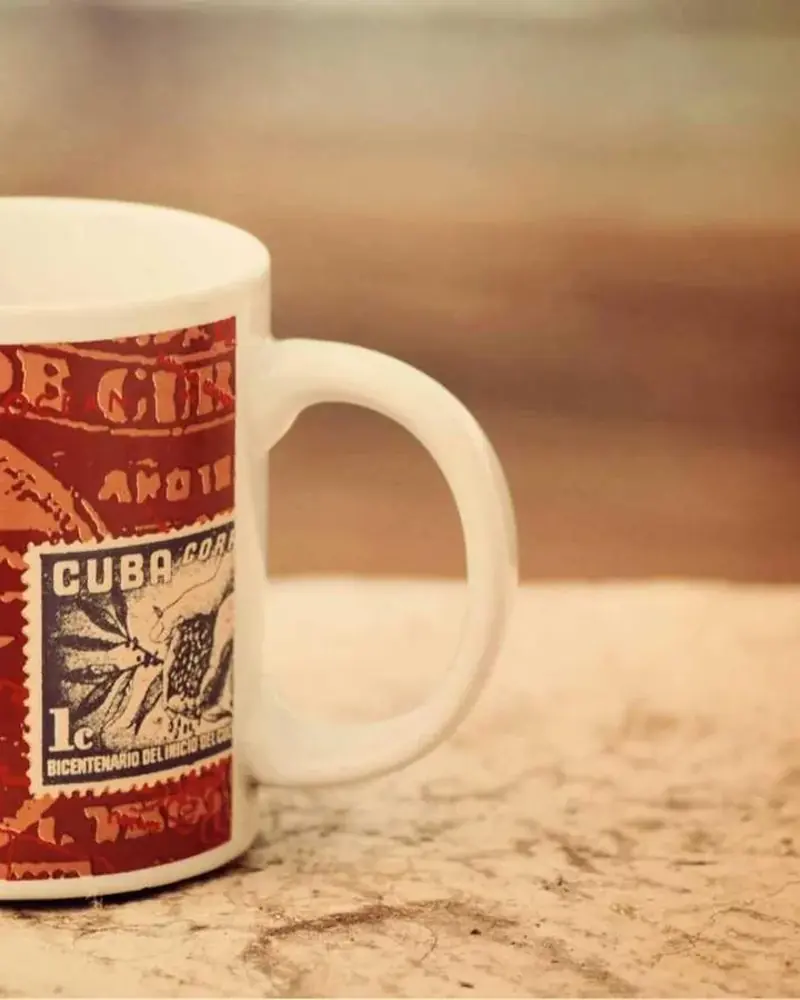
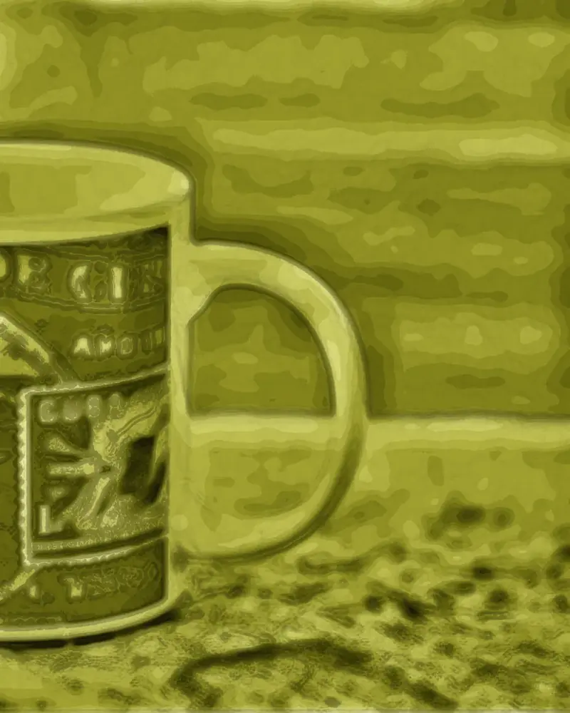
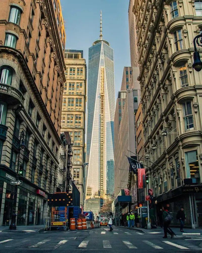
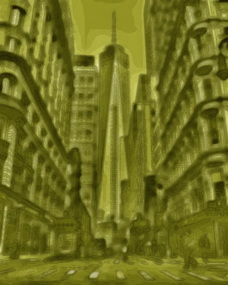
Produced by the tool above at full strength, nothing retouched afterwards.
What the look is made of
Four things happen at once. Red and green are lifted together while blue is cut to a little over half, which is what makes the result chartreuse rather than simply green. Contrast compresses toward the midtones. The black floor lifts, so nothing in the frame is truly dark any more. A little grain goes on top.
Those four are per-pixel colour operations, and on their own they would be reversible. What happens next is not: the image is smeared along its own contours, collapsed onto a single luminance ramp and stepped into fourteen levels. That discards colour rather than shifting it, which is why the file has to carry its own original.
Questions
Is this the same effect TikTok uses?
It is built from measurements of real before-and-after pairs, and the pieces line up with how the effect has been described elsewhere: a flow field that bends the frame along its own contours, neighbourhood smoothing, edge emphasis, tonal steps and grain. The colour behaviour matches closely too, with red and green riding together while blue is cut to roughly half. It is not a byte-for-byte copy of any one app's effect.
Why does it look blocky and painted rather than just green?
Because the look genuinely is. It maps every colour onto a single green ramp and quantises the result into fourteen steps, which is what produces the painted, stepped surface rather than a tinted photograph. That is also exactly why it cannot be undone by analysis alone, and why this page hides the original inside the file instead.
Can I undo it later?
Yes, if you keep the PNG this page gives you. The look itself is destructive - it collapses every colour onto one green ramp, and no amount of analysis pulls three dimensions back out of one - so the original is tucked into the file alongside the picture instead. Hand that PNG to the removal tool and you get the original back, measured at under 1 dE from the photo that went in. A screenshot or a copy that has been through another app loses the extra data, and those fall back to estimation, which recovers shape and shading but not colour.